
A company’s brand is comprised of a huge amount of interactions and elements – and many aren’t totally in the company’s control. One brand element that a company can control, and one that is often overlooked, is the voice of typography/type and how your brand is using it.
What is Typographic Voice?
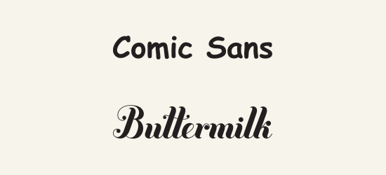
The voice of typography/type can also be thought of as the personality of the typeface (aka font) that is being used, or how it communicates the message. Two extreme examples, seen below: Comic Sans’ voice is playful and childlike, whereas the voice of Jessica Hische’s Buttermilk is elegant, with a slight touch of whimsy.
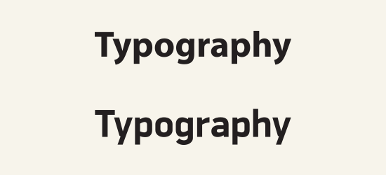
While the differences in the example above are obvious, the voice of the two typefaces below aren’t so blatantly obvious.
It’s also important to make the distinction between typography (the design, layout, and arrangement of type) and type itself (the actual font). I’ll be using the two terms somewhat interchangeably here, in order to make a huge topic somewhat digestible, but do understand that both typefaces and typography have voice.
Typography and type design are two fields that are driven by minute details – not everyone can articulate why a typeface “feels” like it does, or why a typeface communicates a message the way it does, but the impact of good typography is real.
So, it’s been proven that typography matters to the reader, which means it matters to your brand. In a world where tiny details in usability, design, or personality can mean the difference between losing a client and gaining a client, your brand needs every edge it can get – including choosing and using the proper typographic voice for your brand.
The next step, then, is evaluating the voice of typography your brand currently uses.
Evaluating Typographic Voice
While the subject of the voice of typography is worthy of a dissertation-sized read (PDF), here are a few simple questions you can ask about your brand, and the voice of the typography used to represent it, to get the ball rolling.
- What message is your brand trying to communicate?
- What personality traits does your brand want to be associated with?
- What tone of voice does your brand speak in?
- Who is your brand talking to?
- How do your customers view your brand?
If you don’t know the answers to the above questions, you likely need to go through a brand discovery process (feel free to drop us a line if that’s the case). However, if you do know the answers, you can use them to steer the corresponding selection of typography and typefaces.
A Fictional Example
Agent Snowboards (who sell snowboards, but you got that – right?) wants to communicate the message that their brand has a rebellious edge. They want people to associate energy, aggression, and youth with their brand.
When it comes to the tone of voice, they are laid-back and conversational, and perhaps a bit contentious, in nature. They’re talking primarily to males aged 15-24 from upper-middle-class families – active teenagers and young adults who wear Beats by Dre headphones and spend every waking hour at their local mountain. They’re a new company, so they haven’t quite been established in the market yet.
So, 5 questions answered that give us a good idea about their brand personality. Let’s look at a wide variety of potential brand typefaces (these could be used for their logo, or perhaps as a unifying brand display typeface).
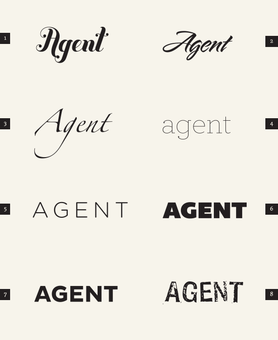
As we move down the list of examples, we get closer to a good match thanks to a correlation between desired brand and typographic voice. Considering the brand outline above, let’s evaluate each example:
Examples 1, 2, and 3 have a voice that is much too elegant & graceful.
Example 4 is too friendly and approachable.
Example 5 is getting closer, but the weight and letter spacing results in a word that is lacking in impact and attitude.
Example 6, while having weight and impact, loses attitude thanks to the friendly, round shape of the ‘G’.
Example 7 has structure and a voice that fixes the friendliness of Example 6’s ‘G’, but we’re not quite there yet.
Example 8 ticks a lot of the boxes when it comes to matching voice to desired brand personality: it has a rebellious edge; it’s aggressive and has movement in its shapes; its voice has a contentious vibe.
Thus, in this particular example, Example 8 is the best option when it comes to matching the voice of the typography to the desired brand personality.
Opportunities to Take Advantage of Voice
The examples we looked at above focus on a single word, in what would likely be a wordmark/logo or heading use case. That isn’t the only instance where typographic voice should be considered, however. We can look to improve the relation between brand and typographic voice in the following areas:
- logotype
- heading typeface & styling
- body copy typeface & styling
- pull quotes/emphasis typeface & styling
- and so on.
It’s easier to distinguish typography with the proper voice for the situation when, basically, there’s less of it. For instance, in the aforementioned logotype use cases, or headings/display type. However, when we move into choosing items like brand body copy typefaces/styling or emphasis copy typefaces /styling, we need to look even more closely at the minute details of the typefaces we’re evaluating. I’m talking contrast, counter shape, letter spacing, terminal/descender/ascender characteristics, and all the other things that make up a typeface.
All that minutia is fodder for another post, but those elements are part of what make the difference between the previously mentioned Typography/Typography example, which I’ll reference here again:
A brand is a complex thing, but typographic voice can influence it. Now you know the basics of the voice of type and how to evaluate how your brand is using it – so get out there and put it to use! But if any of you email me with your biker gang’s logo set in Curlz MT, we’re going to have a long talk.